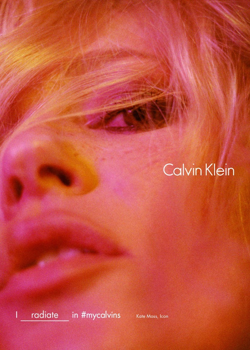
Calvin Klein Unveils a New Logo In Preparation for Raf Simons Debut

The waistband of you or your boyfriend’s favorite pair of underwear is about to get a new look. More specifically, the Calvin Klein logo is getting a new look.
Newly installed creative director Raf Simons continues to put his mark on the iconic American brand even before putting out a full collection. Simons brought in famed graphic designer, Peter Saville (who is best known for creating album art for the likes of Joy Division and New Order) to update the staid CK mark. (Notably, this is not the first time Saville and Simons have collaborated).
The most obvious change is that the logo is now in all caps. Though, the font and spacing has been tweaked as well. The brand premiered the new mark on Instagram, noting that it’s “a return to the spirit of the original” and “an acknowledgement [sp] of the founder and foundations of the fashion house.” For comparison to the old logo please consult your underwear drawer.
Incidentally, this was the last Instagram photo the brand had posted before unveiling the new logo.
Simons, who famously resigned from Dior in 2015, has been quite busy lately. He’s created a new made-to-measure line for Calvin Klein dubbed “By Appointment.” This week he also unveiled the latest collection for his namesake menswear label, the first time he did so in New York. Of course, the main event will be the debut of his very first ready to wear line next month. For the first time in CK history, both men’s and women’s will be shown on the same runway.
It seems that redesigning an iconic logo is becoming a custom for new creative directors.
When he took the helm of Yves Saint Laurent in 2012, Hedi Slimane debuted a new logo for the French house. Like the new Klein logo, it was all caps, sans-serif text.
Jonathon Saunders, Diane von Furstenberg’s new creative chief, also recently unveiled a new logo for that brand. Like the YSL and CK marks, that one too is all caps rendered in a sans-serif font.
Sensing a theme? Maybe it’s also notable that all three brands used to be associated with seriffed monogram logos as well. Basically sans-serif, all cap spelled out logos: in! Logos with just initials and serifs: out!
Watch a Calvin Klein underwear model talk about how he gets dressed: