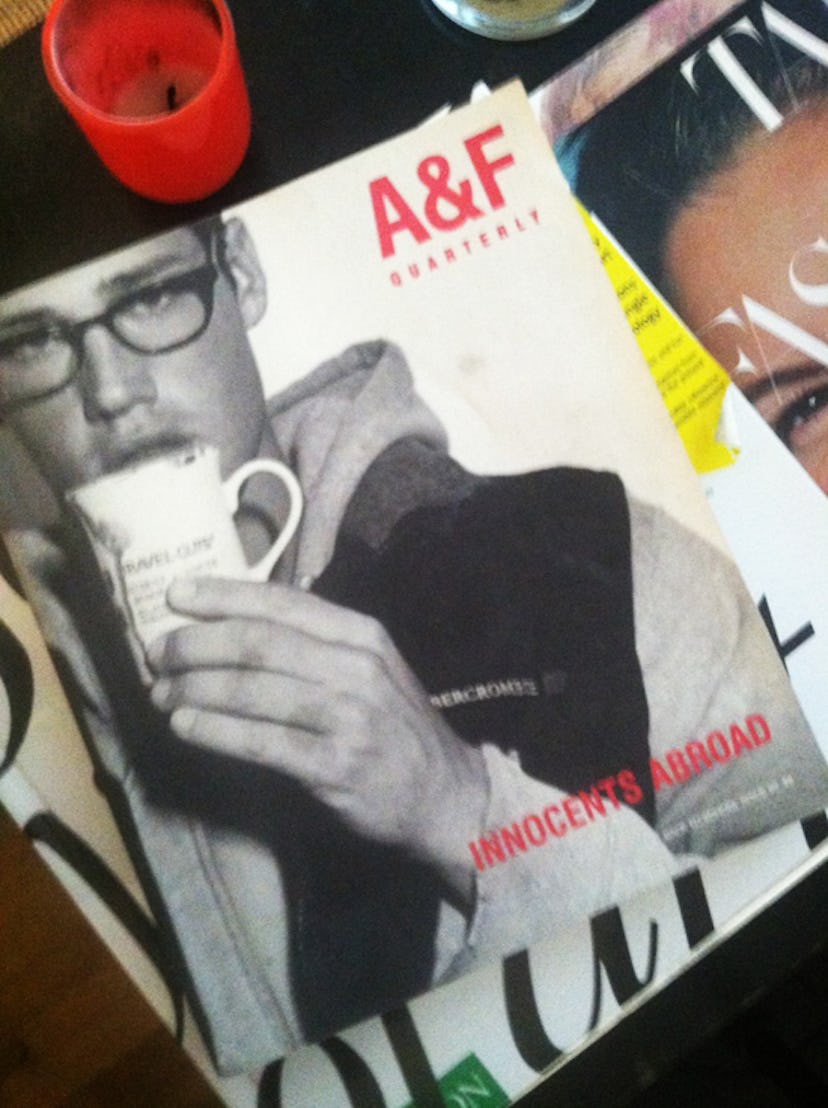
Overlooked: Bruce Weber For A+F Magazine
Bruce Weber is one photographer who works within a consistent style, but his images never fall into the trap of looking the same. Whether it's a Moncler ad or W portfolio (2008's "Summer Camp, "...

Bruce Weber is one photographer who works within a consistent style, but his images never fall into the trap of looking the same. Whether it’s a Moncler ad or W portfolio (2008’s “Summer Camp, ” anyone?), the pictures manage to be both instantly recognizable and novel.
Some of his best, but less highbrow work, appeared in in A & F Quarterly, the magazine produced by Abercrombie and Fitch from 1997-2003. I’m slightly embarrassed to admit that over the past three years, I’ve collected several issues of the publication, resting at home alongside my W‘s. It represents an ideal combination of good and bad taste, and in my opinion, is often overlooked because of it’s, uh, provenance.
Although the publication was criticized for “racy” imagery, as well as some unconventional features (like a drink recipe called “Brain Hemorrhage”), it represents one of the largest reservoirs of Weber’s work. Each issue ticks off his hallmarks: idyllic locations, impeccable casting (often attractive civilians), and a cheeky erotic undertone.
Annual themed issues like Back to School and Spring Break gave loose structure to the content. Fall 1999’s issue, for example, carried the Back to School theme but was titled “Innocents Abroad” and featured portfolios shot around London. Flipping through an issue triggers waves of nostalgia for the happy, carefree nineties, when, admittedly, back-to-school shopping at A&F was a ritual.
The magazine has ceased to print, but back issues are available at Dashwood Books in New York, as well as eBay. We may no longer shop at Abercrombie, but Weber’s photographs for the brand deserve a second look.