COS and Effect

When H&M launched COS in2007, it was as if theglobal fast-fashion behemoth were offering an antidote to its own relentless trendiness. COS (which stands for Collection of Style) is measured, cerebral, and almost minimalist in its approach—in the vein of, say, Calvin Klein or Jil Sander, only more accessibly priced. (Early on, it was even rumored that Sander was designing for the brand.) Consistent with its less-is-more philosophy, COS does not put on splashy runway shows, nor does it advertise—not in a conventional sense, anyway. Instead, since day one, it has embarked on a series of high-profile art and design initiatives. These have included sponsoring programming at London’s Serpentine Galleries and the Frieze Art Fair as well as commissioning architects like Nendo’s Oki Sato and André Fu of AFSO to create site-specific installations that not only broadcast its core philosophy but also provide a window into the creative process of its designers, Karin Gustafsson, head of women’s wear, and Martin Andersson, head of men’s wear.
For their latest such project, on view during this year’s Milan design fair, Gustafsson and Andersson reached out to Daniel Arsham and Alex Mustonen of Snarkitecture. While the Brooklyn design firm has an essentially all-white aesthetic that can be minimal to the point of nihilistic, there is a playful, almost performative element to its work—projects have included a fictitious archeological site for the Storefront for Art and Architecture, in downtown Manhattan, and a 10-foot sculptural Marble Run for the lobby of the Delano hotel, in Miami, during the Art Basel fair. In response to the translucence and lightness of the COS spring collection, the duo conceived a serene, labyrinthine space carved out of some 30,000 strips of suspended white fabric ribbons, which led visitors through a series of rooms to a pop-up shop. Among the accessories on offer was a deceptively heavy, diminutive white gypsum cement Snarkitecture pillow. “It’s pleasantly confusing,” Arsham says of the overall effect.
“In the research for our collections, Snarkitecture’s work kept cropping up,” Andersson says, adding that a Nendo chair had featured repeatedly in his and Gustafsson’s mood boards before they even entertained the idea of a potential collaboration. So what else is on their design radar? “Richard Tuttle, the American post-minimalist artist had an incredible display in the Turbine Hall of Tate Modern, in London, that transformed the space using fabric,” Andersson says. “And the Danish-Icelandic artist Olafur Eliasson’s sculptures and large-scale installations have inspired us for years now.” Stay tuned.
Photos: COS and Effect
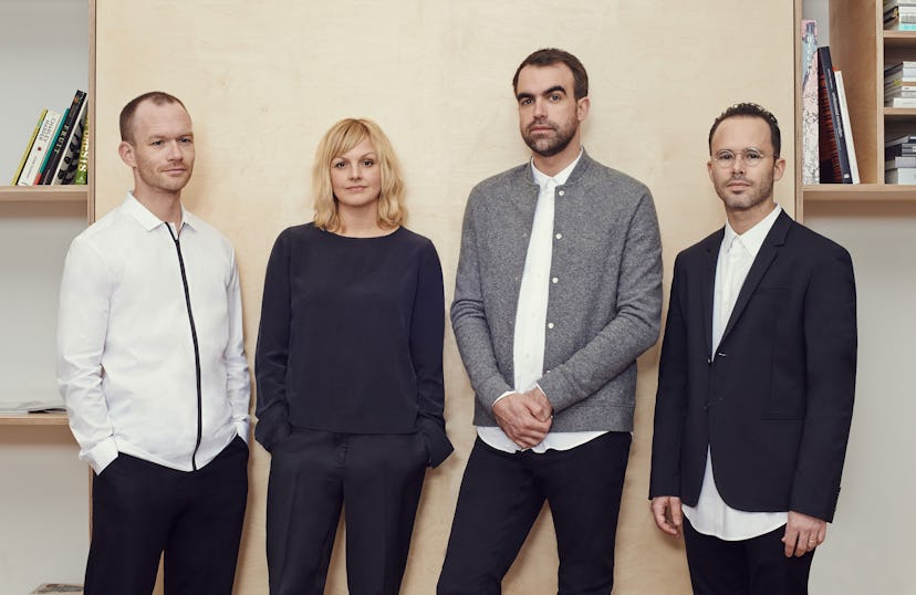
COS designers Martin Andersson and Karin Gustafsson with Snarkitecture’s Alex Mustonen and Daniel Arsham, from left. Courtesy of brand.
Nendo’s installation for COS. Courtesy of brand.
A look from the fall 2015 collection. Courtesy of brand.
Snarkitecture’s installation for COS. Courtesy of brand.
Olafur Eliasson’s Dust Particle, 2014. Courtesy of Iwan Baan.
Richard Tuttle’s I Don’t Know. The Weave of Textile Language, 2014. Courtesy of Tate Photography.